

Wednesday “Wisdom” – Simplicity & Thought in Web Design
Rarely, if ever, have we “tooted our own horn” in a Wednesday “Wisdom.” But, seeing as we just launched the new TMG website, I figured that it was a good time to give some pointers on web development.
The Mac Groups’ Home Page
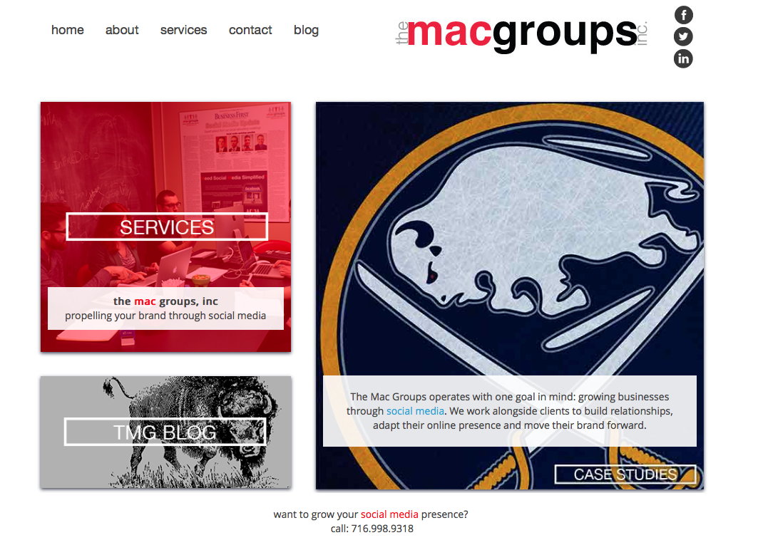
Being the most important page of any website, we took time to consider the layout of these images for optimal aesthetic practicality. We ended up going with a fibonacci gestalt layout (do you see it?):

You can Google “gestalt design examples” and find a lot of images from which to draw inspiration. This particular design offers a path for the eye to follow. Whether you head into or out of the spiral, you land on important information about our company.
We also employed the use of negative white space in order to create the appearance of borders, without actually using borders. Therefore, we managed to avoid cluttering the page with unnecessary design elements, making for an open, spacious feel.
Our Services Page
Here, we use images to relay information:
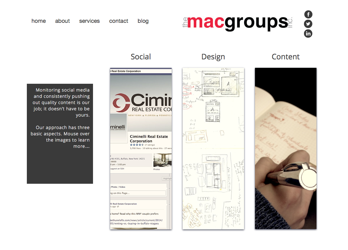
In order to reduce both the clutter of excess page text and to avoid unnecessary browsing to additional pages on the site, we employed a “mouse over” function in order for users to find out more about our various services. Furthermore, you’ll notice that the text is aligned to the right, against the images, pulling the eye to the images, which represent our services.
Case Studies
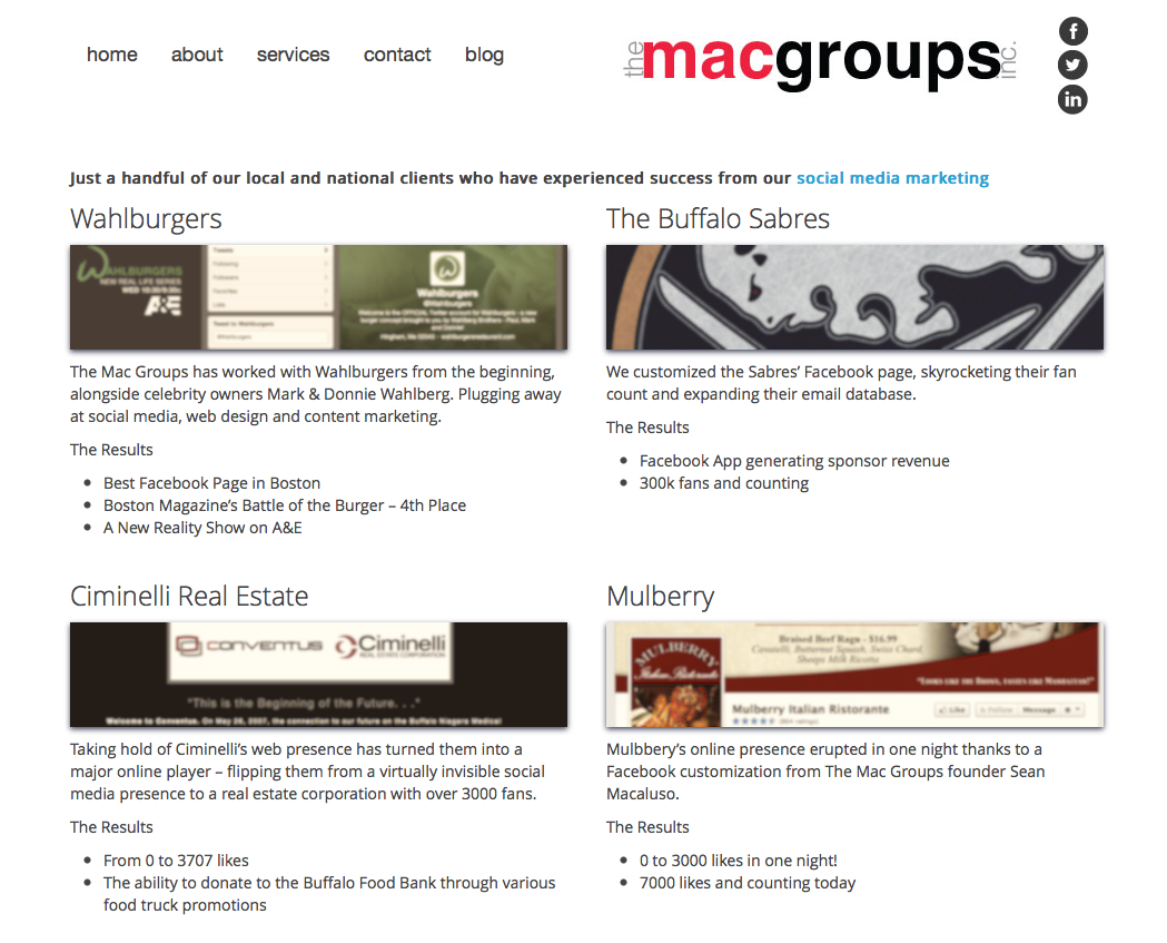
Another page with vital information, we wanted to make sure that users didn’t need to scroll in order to learn about our clients and results. So, we organized the images and text for optimal spacial use, making it easier for the user to get the info that they want, whether by skimming or thorough reading.
Contact TMG
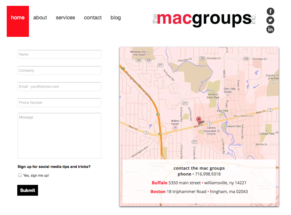
This vital page often gets overlooked by developers and business owners. We trimmed down our contact form to better align with the map image. Furthermore, we tinted the map red to connect it with our red motif throughout the site – utilizing the map both as a functional aspect to the page and a reflection of TMG branding.
Conclusion
What can you take away from this? Attention to detail matters and simplicity reigns for relaying information. Keep in mind that this will synergize with other web pages elements, including SEO and inbound social media for both an improved user experience and better rankings in search engines.
So, leave a comment to let us know what you think of the new site and stay tuned for more social media and web development posts!
Tags: Web Development