

Keeping Your Web Development Current
I will be the first to admit that technology moves far to quick for us to keep up. I’ve had an iPhone 4s for 2 years and now I’m two phones behind in the Apple world. Fortunately, my phone’s recency doesn’t affect my brand’s marketability. Well, at least not as much as my website’s recency.
So, you need to have an up-to-date website. It’s just necessary. But, the question is: how often do you need to update your technology? Is it a matter of interval updates or do you simply need to keep track of new waves of technology? Probably the latter.
To tell you the truth, I’m not too sure what’s coming next in the “necessary web technology for business” timeline. But, here are two things that you definitely need in 2014:
First – You need a Mobile Website
If I look at any of my website’s analytics, at least 60% of the visits are from mobile devices. For my site with the most traffic, it’s hovering between 65% and 70% for mobile and tablet combined.
But this is the thing – those mobile visits are close to useless if your mobile bounce rate is extremely high as well. Bounce Rate refers to the rate at which people visit your site and immediately leave for any reason. If you notice that your mobile bounce rate tends to be far higher than that of your desktop, it’s most likely because your site doesn’t load fast enough, lacks functionality or simply looks bad in a mobile browser.
So, you have two options: create a mobile site or redevelop your entire site into a responsive format. I suggest the latter, as it allows you the opportunity to get current in some other web development aspects in addition to the mobile side of things.
What is responsive design?
Take a look at the varying window sizes of The Mac Groups Home Page to see:
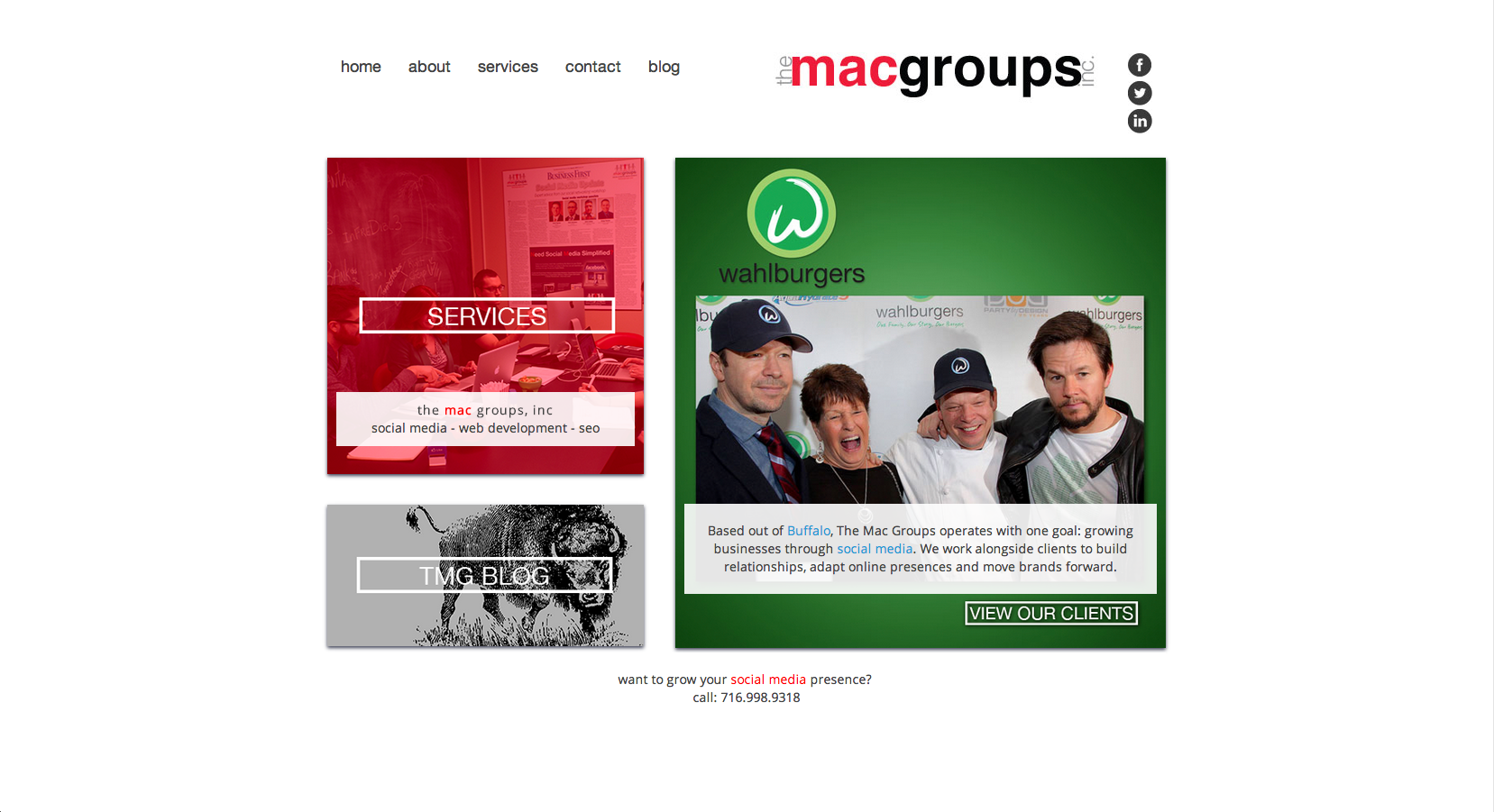
Desktop Resolution
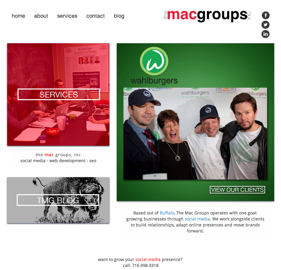
Approximate Tablet Resolution
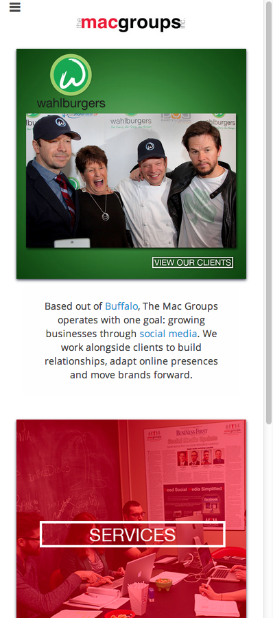
Approximate Phone Resolution
The layout of our webpages responds to your browser’s resolution. Therefore, with responsive design, you get three sites in one, accommodating for desktop, tablet and mobile resolutions.
Second – You Need Simplicity
Web development accounts for more than page layout. Content is a very important aspect that you need to coordinate with your developer. Keeping both the layout and the site content simple will attract more eyes, encouraging people to browse for more information.
Every important page should be accessible from your home page, via main navigation or drop down menus. If important content gets buried in the site, and a user must click 2 or 3 links simply to find the page that you want them to see – you will run into problems.
So, simplicity applies to appearance, navigation and content. By reducing the page count on your website, you can reduce the need for a convoluted navigation, therefore reducing the clutter on your homepage. As I’ve said before, keep tips and other sorts of extraneous information for the blog. Services, contact info and your team members should be in the navigation. If you run a hospital, throw in a diagnostic page of some sort. If you’re a lawyer, throw in your areas of practice. But, if you start including random tips or non-vital information, you deter navigation to vital pages by giving too many options.
Tags: Web Development