

New Design & Layout for Facebook Business Pages
If you perform social media marketing on Facebook, you may have received a message offering to add you to the waiting list for an updated design. Let’s take a look at the layout you have:
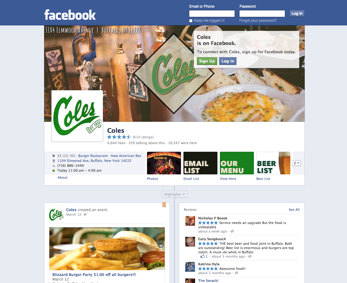
This is the old or current layout for a Facebook business page. You are probably fairly used to it by now, but as with many things, you might be getting a bit bored of it, since it’s pretty old now. Plus, it is a somewhat boring design in general. The posts and reviews are perfectly symmetrical and the contact info isn’t too exciting. Although, the apps are very easy to find, as they sit just under the cover photo at all times.
So, how does the new layout look?
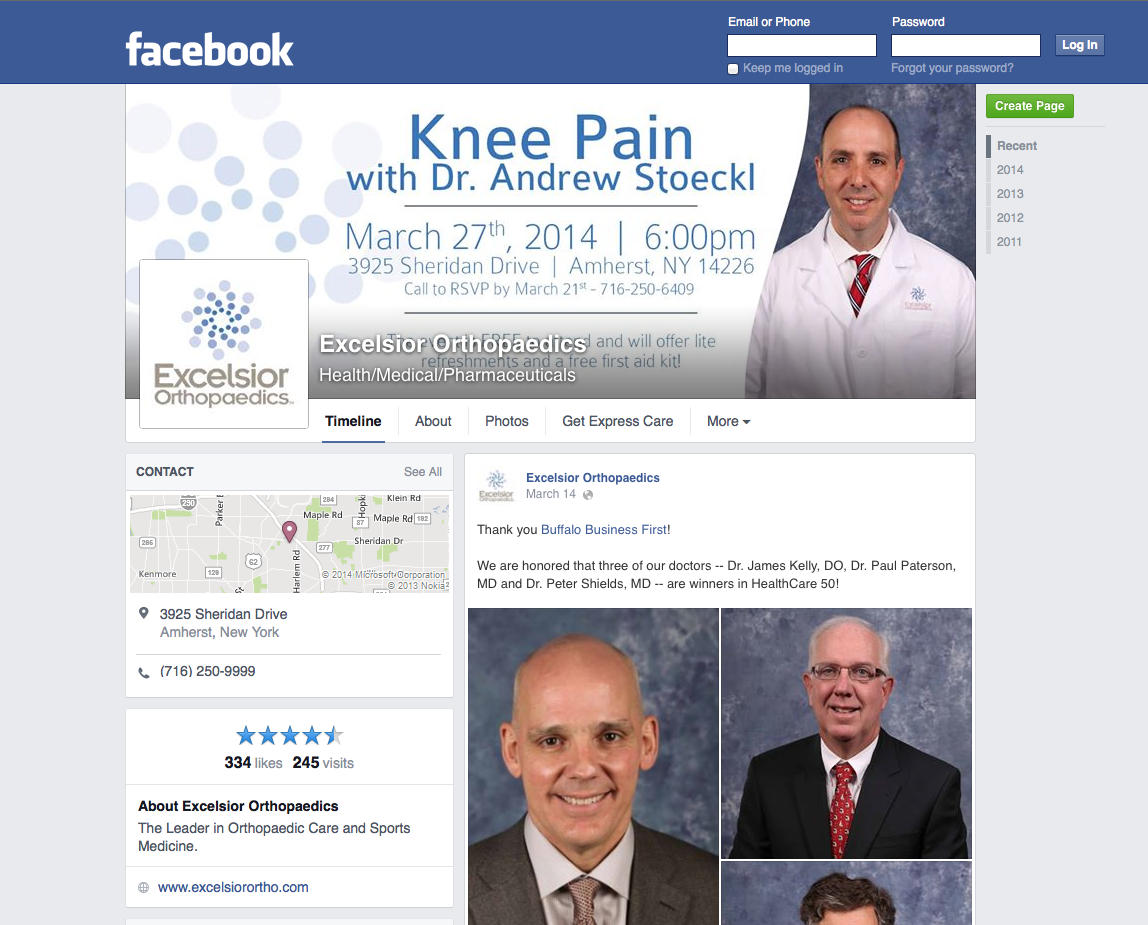
Alright, so we are off to a good start here. You might have noticed that the design resembles the current personal profiles more than the old design. Very similar ratios for the info on the left and the posts on the right. Furthermore, the contact info pops a bit more with both its position and the incorporation of the map. The star rating is very prominent and the posts are easy to read since they are a bit larger than other page aspects.
However, above the fold we miss something pretty important… the apps.
You have to scroll a bit to get to the page apps now, which lie right under the star rating. For any business page, this isn’t exactly a pro. Yes, the overall design looks nice and it might avoid crowding by placing the apps below the page fold, but it can deter people from finding the things that a business wants to promote.
That being said, I’m sure that Facebook has done their research and thought well and good before moving the apps. If they get negative feedback or find that page engagement slides, then they will certainly make up for it. Currently, you can definitely get the most out of your posting section by pinning important items to the top, since a substantial amount of page real estate goes to the top post.
Overall, I think the design works – at least aesthetically. Functionally, you’ll definitely get more eyes moving toward the contact info, which is huge. Plus, you can really bank in on the post section with promotions, etc., so that’s pretty awesome. Getting used to the loss of apps above the fold will be a process, but I think most businesses will make do and possibly even prosper since so much real estate has be allocated to posting and contact info.
What do you think? Do you like the new layout? How do you think the changes will affect your page and what creative ways do you see to get around the loss of apps above the fold?
Tags: Facebook, Social Media Marketing