

Facebook & Twitter: The Old & the New
A few weeks ago, we did a short post on the new Facebook redesign. Today, we’ll get a bit more specific so that our social media marketing clients can have a firm understanding of how exactly their accounts will change…
The New Facebook Layout:
Facebook introduced its newest redesign in early March 2014, and will continue to roll it out on existing pages during the upcoming months. According to Facebook, the redesign of the Page Timeline layout is intended to help admins “find the tools they use the most.” Though it is not a hugely drastic redesign (unless you’re a designer that now has to follow different templates), it is still sure to make some of us scratch our heads.
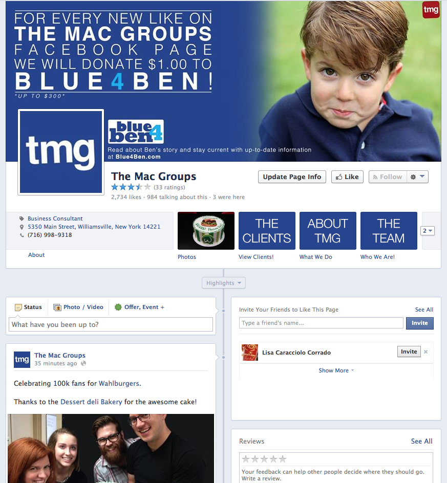
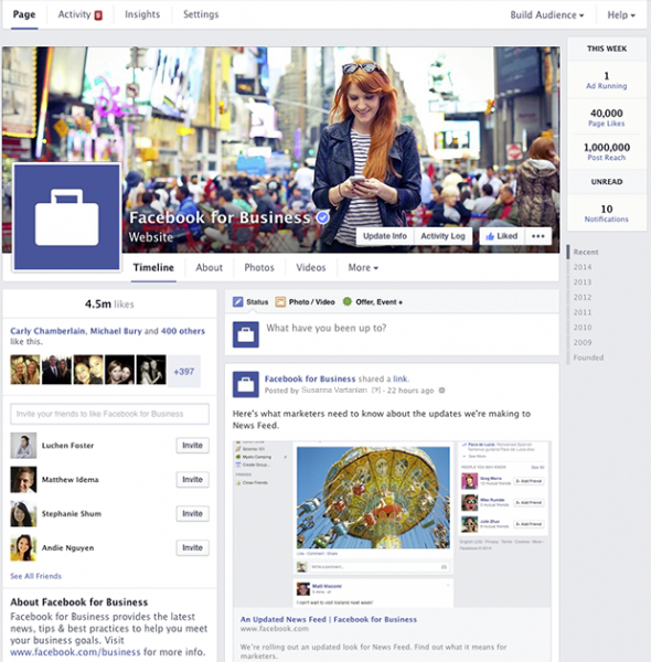
We still have a Facebook profile cover photo at the top and profile picture to the left of the profile. However, we now see the Facebook Page Name and the Liked, Following and Message buttons overlaying the profile cover photo. These are among the nuances that will cause a headache for a graphic designer. Another noticeable change is that the Facebook App Tabs are no longer prominent under cover photos. Now, we see a menu under the cover photo, on the left hand side, for your Timeline, About, Photos, Videos and low and behold, the custom Facebook Apps. However, if a page has numerous apps, to see them all, we will have to click the More tab. Which, in my opinion, is a huge bummer. But we can find the custom Facebook Apps displayed somewhere else. Let’s dive a bit deeper.
Remember on the old Facebook layout where your Facebook posts would stagger between the left and right side of the profile? Well, not anymore. Now we see the page news feed in one column! No more bouncing back and forth between the left and right columns. Your page news feed has one linear column on the right side of the page. The left side of the profile now features page details, including, the company’s address and contact information, a thumbnail look at your photos and videos you have posted, our custom Facebook App tabs, and other information such as page likes, notes, reviews, etc. I, for one, am a huge fan of the left column being page related and the right column being designated to the page news feed. It gives the whole page a simpler, and more uniform look and feel.
One thing I would like to see Facebook implement would be a drag-and-drop feature to be able to edit the left column, where admins could select where certain information would appear, such as custom Facebook apps toward the top, allowing admins the ability to say what is important on the page, instead of Facebook assuming what is most important.
After the initial shock of a redesigned Facebook profile wore off, I felt that this is a solid update for a simpler user experience and an overall cleaner look. Kudos to you, Facebook.
The New Twitter Layout:
Twitter has gone through its share of changes over the years, but none quite as drastic as the new layout which launched in early April 2014.
Twitter: The New Facebook
We are all familiar with the old layout design with the bulk of the information laid out in the center of the profile. At the top, the profile picture, twitter handle, and profile description (Bio, location and website link) all on top of a profile header image in the background. From there, you can see the menu containing Tweets, Following and Followers. And to the left, we see small thumbnails of our photos and videos and suggestions of who to follow.
Now, as we scroll down the screen, we see all of the tweets we posted (including retweets) in chronological order. Very simple and easy to read. Not too much thought has to go into understanding what is happening on the screen in front of us. But, living in a world of constant change, nothing is safe. Yes, that means you too, Twitter.
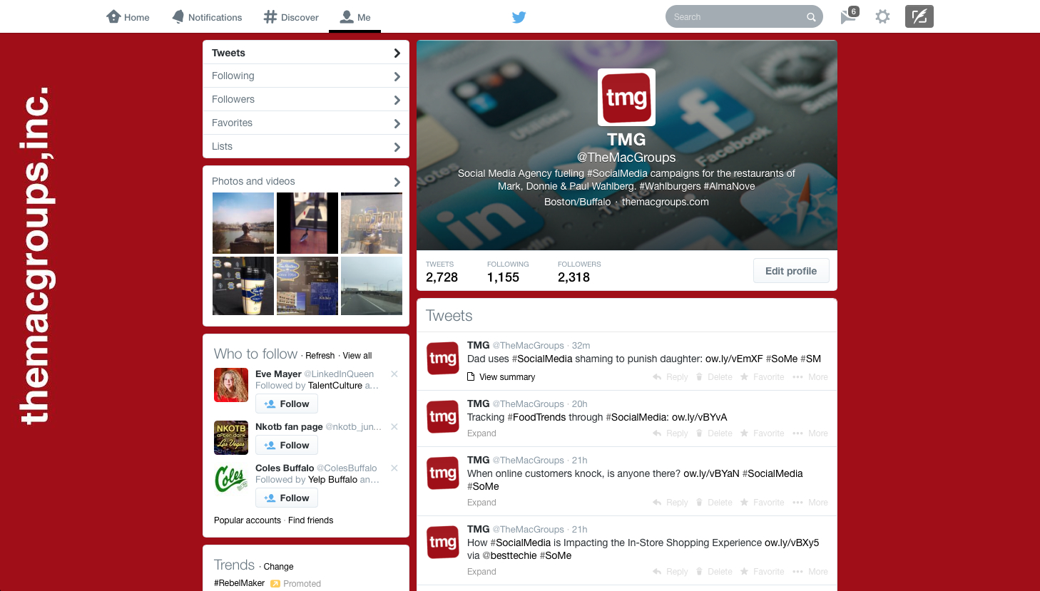
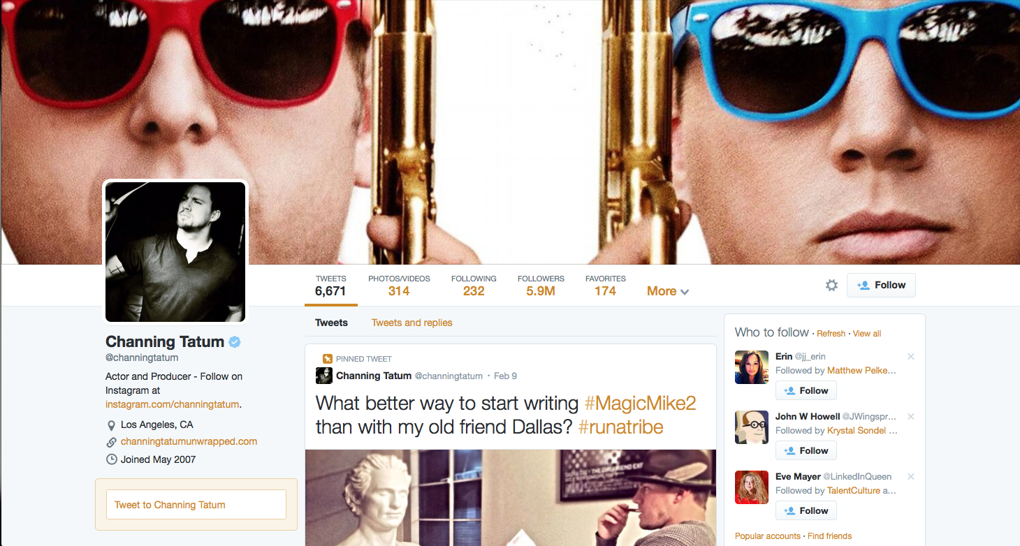
The recently rolled out, new Twitter layout appears to be modeled very much after the mega social media giant, Facebook. It also seems Twitter felt the need to scale up everything about its new layout — Larger profile picture, larger profile header, larger images and larger fonts (that will also differ in size, but we will get to that).
First, we notice a new area for a profile header image which very much resembles that of a Facebook cover photo. Before, this profile header sat in the background, behind the profile picture and description. Now, at the top of the page, it is one of the most prominent features. The profile header is sized at 1500 pixels wide and roughly 400 pixels high, but that will fluctuate depending on the size of the browser window. In any instance, that is significantly larger than the pervious Twitter page layout. Same goes for the profile picture, which is now moved to the left side of the profile, very similar in style to Facebook. The profile picture jumps up from being sized at 73px x 73px to now being 400px x 400px.
As we dive farther into the new layout, we find a feature that some may like. On the left side of the page, under the profile picture, we find Twitter names, handles, descriptions and website links. And across the top of the profile, under the profile header, we will find a menu consisting of Tweets, Pictures/Videos, Following, Followers, Favorites and Lists. Lastly, the Who To Follow menu has been moved to the right side of the profile, completely opposite from before.
Just a few other features to point out… First, the ability to “Pin” Tweets to the top of the feed (yes, that is a Facebook-style feature) make them more prominent, as users will see them first upon visiting the profile. Secondly, we now have the ability to filter tweets, meaning you can filter tweets you want (or don’t want) to see when visiting another person’s profile. This includes seeing only Tweets with replies, or one’s with photos, etc. The last feature is sure to turn a few heads though. Tweets you send out will now vary in font size, depending on the popularity of your tweet. The popularity will depend on how many followers you have, how many times it was favorited, retweeted, etc. The more popular a tweet becomes, the larger the font size will be.
Ultimately, it appears that Twitter is trying to keep users on the site for longer periods of time. Instead of just scrolling through a timeline of tweets, Twitter wants to direct users to individualized profiles filled with large inviting pictures and easy to navigate layouts.
Twitter’s new look is already up and running for new account sign-ups, while those of us who already have accounts will see the new design appear sometime in the next few weeks.
There is good news for those who don’t want change: If you use Twitter from a mobile device, you likely won’t notice any change. And, that’s a large portion of Twitter users. 76% of Twitter users now use the service from mobile devices. The redesign will only impact the 24% of users who use Twitter from the twitter.com website.
Tags: Facebook, Social Media Marketing, Twitter